
The
EXTREME WEBSITE MAKEOVER
Guide
for horse trainers, equine practitioners, barn owners & equine-facilitated therapists
Confused about what to put on your Home page?
Tired of rewriting your About page?
Stumped by what to say on your Services page?
Finally unhobble yourself from
website-creation-freeze!
Create a beautiful, clean and effective
website that makes you proud of
what you do, designed to make the
right clients reach out for your service.
Without starting from scratch, having to
rework a template that was never designed
for horse professionals, or hiring
an expensive designer.
So if you want to learn how to:
● Plan out a wildly effective website
● Describe what you do in succinct words
● Book more clients you love...
...then follow a proven process as you fix your website.
No website yet?
No problem.
Included are recommendations for the right platform
and a selection of my equine-specific designs of
websites-that-sell packages!
What We'll Cover In This Guide
Click to navigate
Chapter 1
5 Powerful Webmarketing Tips
A website should no longer just be a digital brochure. That worked at the beginning of the digital age, but today a website should do 3 things for you!
1 - It should create trust and credibility.
2 - It should convey within seconds that you can solve the visitor's problems.
3 - It should move the visitor to take action towards becoming your client.
And while you'll learn all the design and copywriting strategies to optimize your site, the 5 methods listed below are your most powerful marketing tools.
Implement just those 5 and you'll be miles ahead of most anybody in your field and/or neighborhood.
Headliner
A direct call-to-action
A transitional call-to-action
Customer focused copy
Aspirational images
Let's jump right in!
1
Headliner
This one may seem obvious, but it's still essential.
Often, small (and large) business owners don't understand what truly motivates their potential customers.
In general, winning headlines are short, snappy and tell the story along with a solution and a description of the reward.
You also want to make sure that users' eyes are drawn to the page headline as the first thing they see. (See example below.)
To make sure you're getting readers' attention, ask your friends to check out your page and tell you what they see first. And if it's not the headline, redesign the page until it is.
Here are the results of one experiment Inc. Magazine did with different headlines on a page:
‘If you're a running shoe retailer,
"Free Shipping on All Products"
doesn't tell your story.
Rather, a headline like,
"Huge Selection of Discounted Running Shoes"
will do a much better job of letting users know that they are in the right place.
What would this look like on an equine website?
Remove the logo that is right smack on your most valuable real estate on your website...in your hero section.
Nobody cares about your logo.
Place it in a small size in the top left corner.
Instead, tell the reader how you can help them...in 1 simple sentence.
'Helping You Have Safe Fun On The Trail'
'Barefoot Shoeing Advice For The DIY Trimmer'
'Win Your Next Show With A Relaxed Horse'
That's what is interesting to the reader!
Not your logo! You're not Coca Cola or Chanel. ;-)
In general, avoid the trap of being too creative.
Marketing headliners that make snazzy brand advertising rarely have a place on a small business website.
Below are 2 examples of different industries...but can you see how this works?

2
Direct Call-To-Action
I invite you to check out a few random websites and you'll see that they may look professional but are not guiding the visitor to take action towards becoming a client.
That can be done by adding Call-To-Action buttons.
But MOST websites don’t even have a single Call-To-Action button across all their pages.
What kind of call-to-action button would be good for your equine site?
Here are some examples:
● Book An Exploratory Lesson
● Get Started
● Submit Your Question
● Buy Now
● Set Up A Consultation (Visit)
● Call Me Now
● Message Me With Your Question
Be brave. It’s really OK.
Doesn’t it drive you crazy when you can’t find someone’s email address or phone number on their websites?
Make it easy for people to get in touch with you, several times throughout your website pages.
Click below to see the placement of call-to-action buttons on one of my templates.
3
Transactional Call To Action
Continuing with the theme of Call-To-Action (CTA), if you want your website to be your selling tool, one that works 24-hours a day for you, you want to include a transactional CTA.
Why and what is it?
Because not everyone who lands on your website is going to buy or book a call immediately.
You want to woo your potential customers and get them warmed up to your services. That's where transactional CTAs come in.
You do this by taking the position of the experienced 'guide' and offer something of value to them before asking something of them.
This could be a video series, or a PDF, a checklist, or something totally unique that you think up.
It must be packed with value and enticing enough for your potential customer to
give you their email address in exchange for it.
Not including a transactional CTA is a big mistake because you’re letting all those potential new clients click away from your site, even though studies show that over 90% of 1st time visitors never return!
Include a transactional CTA and set up a few email autoresponders and watch your email list and pipeline grow.
To get inspired, CLICK HERE and scroll down for some great freebie ideas....
BTW, did you notice how I use a transactional Call-To-Action right here?
4
Customer-Focused Copy
Most websites are noisy. Too noisy.
My suggestion: stop flooding our audiences with noise, and start talking about their problems.
Only then do we earn their attention!
Another copywriting mistake that many business owners make is that they talk too much about themselves.
Here’s a simple test to see if you talk more about your brand than you do the customer – count how many times you use the words “we” “us” “me” “my” or “I” on your website and compare that to how many times you say “you”.
Chances are you use that first string of words far more than you use the word “you”.
This simple test will help you to determine if you need to talk more about your customer and the problems they face.
Focus on the external and internal problems and unfulfilled desires that your ideal customer faces.
Really dig into those problems so that your customer knows you understand them, and you can position yourself as the guide further down the road.
When you talk more about the customer and less about your brand, you’ll always win.
Examples:
External problem (physical):
* Stop your horse from bolting
* Fix your horse’s lameness
* Get a saddle that fits
Internal problem (emotional):
* Fear of getting hurt
* Discouraged by having tried so many remedies
* Worried about the costs
* Insecure about asking for help
Unfulfilled desire (the reason why):
* Galloping carefree
* Enjoying nature with horse and friends
* Feeling accomplished and proud
* Creating a deep bond with horse
Those are all focused on the reader, not on you!
Your job:
Remove as many ‘I’ and ‘we’ statements from your site as possible.
My website template packages include a comprehensive training that teaches you how to write customer-focused copy.
If you want to learn more, click the button below!
5
Aspirational Images
Show smiling happy clients with their horses.
Count how often you have images of yourself on your website. That’s okay...in the About Us section, once in a while.
The rest of the time, the images should convey happy clients.
Images speak a 1000 words.
If you are working with beginning English riders, then show them.
If you are teaching vaquero-style horsemanship, then show your clients, both in the traditional outfits AND without (if you want to attract an audience that wants to enter that world, and is not yet in it).
If you offer equine massage, show the horse before and after. And show happy faces of the rider, possibly even riding.
Because the rider pays for the massage and the outcome of the massage is not JUST a happy horse, but also a happy rider!!
We know this is a lot to take in, especially the wordsmithing. You can see this all in action on our GREEN FOREST live template demo so you can visualize how it looks on an actual page!
Want To Skip Right To Choosing A Template?
Don't have a website yet?
Feel that editing your existing one is a daunting task?
I have created equine website templates you can use to easily fill in the right words (the templates come with all the training you need).
With these templates and all the instructional material that comes with it, you can skip that blank page paralyzation stage and get rolling with your writing.
Add your images, follow my instruction on writing simple copy, click 'Publish' and hop back in the saddle.
Click on the left to access my templates and skip reading through the rest of this makeover guide.
Otherwise, continue to follow and let's keep going!

It fits in my busy schedule
"Christiane's ability to explain marketing and business development in a way that is both understandable and workable within the constraints of a busy life is just brilliant."
- Rachel Windchaser - Windchaser Ranch
Chapter 2
Creating a Memorable “What do you do?” Statement
Do you get tongue-tied when others ask you what you do?
Do you say something like this?
- I start young horses
- I teach horsemanship to beginners
- I’m a saddle fitter
- I’m a clicker trainer for horses
- I am an equine massage therapist
And while you say it, you see the interest in the other person wane before you finish your sentence?
Below are 5 conversation-inviting alternatives to the introductions above!
And don't just use them when networking.
Add the short version of this one-liner on 'hero' (top) section of your website!
Always think:
- problem
- solution
- outcome
Copy and modify the examples as needed! Then place the short version on the hero section of your home page!
Good Examples:
1- Most horse owners worry about getting their horse started too fast and don’t know who to trust with their young horse. (Problem)
We designed a 12-step process that patiently teaches the horse how to calmly carry a rider. (Solution) So you can both have fun together. (Reward)
Short:
We systematically and patiently teach your horse to enjoy carrying a rider!
2 - Many women dream of owning a horse, but are afraid of getting hurt. (Problem)
We help first time horse owners learn how to keep themselves and their horses safe. (Solution) So that hacking out is the best part of their day. (Reward)
Short:
We help you and your horse be safe...no matter where...even if it’s your first horse!
3 - Many horse owners don’t know how to fit their saddle correctly to their horse and how that contributes to an anxious horse. (Problem)
We help you evaluate your saddle fit, so that you can make informed and smart decisions about fitting your saddle. (Solution) And feel your horse instantly relax. (Reward)
Short:
Enjoy a relaxed and happy horse with a saddle that fits like a glove!
4 - Many riders today are tired of using forceful methods to make their horses comply. (Problem)
We teach horse owners how to train their horses on voice cues...free of any force. (Solution) Built on trust and consent. (Reward)
Short:
Force-Free Training...teach your horse voice cues, for a partnership of a lifetime.
5 - Many horse owners are shocked to find that their ‘compliant’ horse has lost complete trust in humans. (Problem)
We teach you a 5-step method to relieve years of built-up tension and stress in your horse’s muscles. (Solution) So your horse comes to see you as the place of peace.
Short:
Release your horse’s long-held stress and stiffness and restore your horse’s belief in humans...even after years of mistreatment.
Clarity from coaches who lives horses....
"I was so confused. That is the big thing I get from working with Christiane, clarity.
Other coaches say it doesn't matter what your niche is, that their trainings work for everyone.
They're wrong.
You need someone who clearly understands horse people if you want to develop clarity."
- Trish Hyatt - Working Equitation Simplified
Chapter 3
Tested Web-Design Principles That Work
Before we get to the content of the individual pages, let's have a look at the essential design frameworks of any good website.
Remember, to create a website that brings you clients you love and need.
I know that one of the confusing things about websites is the design.
You start stressing about fonts.
You start worrying about colors.
You try different effects.
You wind up in the same trap that every novice designer does.
With an understanding of the principles below, you'll be able to make your website come to life and easier to read on the screen, therefore keeping visitors on your site longer than the average 2 minutes and 7 seconds.
Remember that a website-that-works must combine design, copy and marketing!
This is your chance to get the design part right!
1
Font Size
Designers often use ratios of fonts to each other.
Some like 3:4, others 2:3 ratio.
Let me give you a scale that you can use to preset your font sizes for the whole website.
The 3:4 ratio leads to setting your different fonts in the following sizes:

As you can see, a 1/3 of 9 is 3, adding 3 to 9 becomes 12 etc.
Or you can set it in this ratio. Either way, it makes the page more harmonious and finished-looking.
2:3 ratio:

With these simple tricks, you can comb through your site and finally feel confident that you can fix and improve the readability and clarity of your site.
BTW, this guide is adhering to the 3:4 ratio as do our templates!
Credit and gratitude for this goes to David Kadavy from
https://designforhackers.com
2
Paragraphs
It's much harder to read and comprehend on the screen than it is reading a book.
That's why website visitors SCAN.
You do. I do!
How then can you make your text easier to read or look over? You can best get your the most important points about your service across by spacing your sentences out.
In addition, the visual weight of an element (especially text) is how much it stands out to the eye of the viewer, but only in relationship to each other.
So, if a font is bold, it has more weight than a light one, but less weight than an extra bold weight. The same goes for color. If everything is black and white, a color element stands out.
Or if you’re designing a section that has dark background, white text, understanding these 2 principles, you can draw attention to where you want visitors to look and what you want them to read.
Below I just wrote up a Lorem Ipsum text (filler text) to demonstrate the example, also using the 3:4 ratio from above.
The text is IDENTICAL.
What do you think will be more easily understood and acted upon?
Before spacing...
Lorem ipsum dolor sit amet, consectetur adipiscing elit, sed do eiusmod tempor incididunt ut labore et dolore magna aliqua. Ut enim ad minim veniam, quis nostrud exercitation ullamco laboris nisi ut aliquip ex ea commodo consequat. Duis aute irure dolor in reprehenderit in voluptate velit esse cillum dolore eu fugiat nulla pariatur. Excepteur sint occaecat cupidatat non proident, sunt in culpa qui officia deserunt mollit anim id est laborum.
After spacing...
Lorem ipsum dolor sit ametConsectetur adipiscing elit, sed do eiusmod tempor incididunt ut labore et dolore magna aliqua.
Ut enim ad minim veniam, quis nostrud exercitation ullamco.
Laboris nisi ut aliquip ex ea commodo consequat.
Duis aute irure dolor in reprehenderit in voluptate velit esse cillum dolore eu fugiat nulla pariatur.
Excepteur sint occaecat cupidatat non proident, sunt in culpa qui officia deserunt mollit anim id est laborum.
3
Fonts
Often websites contain too many different fonts. This makes reading harder and diminishes the power of the words.
It is much better to pick 2 contrasting fonts (like in this workbook) I use Droid Serif and Monserrat.
One is a serif font (you'll recognize it by the slight projection finishing off the stroke of a letter) and one is a non-serif font.
Non-serif fonts like Monserrat are easier and faster to read, but adding a serif font like Droid Serif adds to the richness of the design and distinguishes the titles from the descriptions.
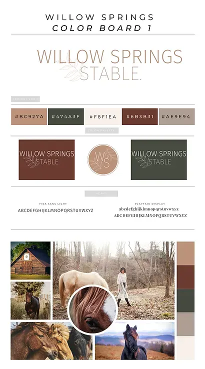
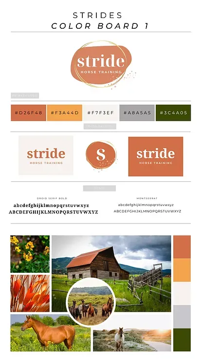
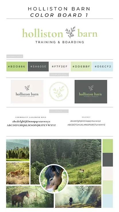
As part of my template packages, I have added these brand boards that give you both the color themes and the fonts that work well together.
Have a look below...
Want to use design, copy and tech to help you build an impactful, profitable horse business?
Here is your solution...
If you don't have a website yet, or feel that editing your existing one is a daunting task, I have created equine website templates you can use to easily fill in the right words. (The templates come with all the training you need).
With these templates and all the instructional material that comes with it, you can skip that blank page paralyzation stage and get rolling with your writing.
Add your images, follow my instruction on writing simple copy, click 'Publish' and hop back in the saddle.
CLICK HERE to access our templates and all the information about the courses, and skip reading through rest of this makeover guide.
BTW, the templates come as preloaded websites with all the automations and emails done for you!
Otherwise, continue to follow each step below and transform your site, your business and the lives of many more horses!
4
Color Families
As you've seen on the brand boards above, consistency in the use of color makes a HUGE difference in the professional look of your site.
It's wise to pick 4-5 colors but use them in different quantities.
For example, on this page, you see that all the text copy is written in black with occasional color highlights.
You see this color and this color used in accent areas. The green tone is used only in the footer and in the call-outs to distinguish those elements clearly from the rest of the page.
This 'sticking' to a family of harmonious colors sets the tone of the whole site and gives it a unified look.
Before the internet, when I studied fashion design in Paris, we spent a lot of time in art and fabric stores searching for the just-perfect tones.
Today, when you create websites, you can set the 5 colors.
Once you set the tone palette, the platform will give you those choices every time you want to change the color of a word.
Okay, next we're off to the races, and we'll look at all the elements each of your essential pages should contain to help you book new clients you love...24 hours a day!
Chapter 4
How To Create A Home Page
Okay, congratulations for following along this far.
Remember, don't binge-read, IMPLEMENT!
Now, that you're equipped with the essential principles of web marketing, web copy and web design, let's look at what should be included on each individual page.
First of all, what are your essential pages:
● Home page
● About Us page
● Service page
● Contact page
Yes, honestly, you don't need any more pages.
If you have the time, I'd also add a blog (BTW, our templates include a predesigned Blog Archive page and individual Blog page layouts that are designed to get readers to book appointments with you!)
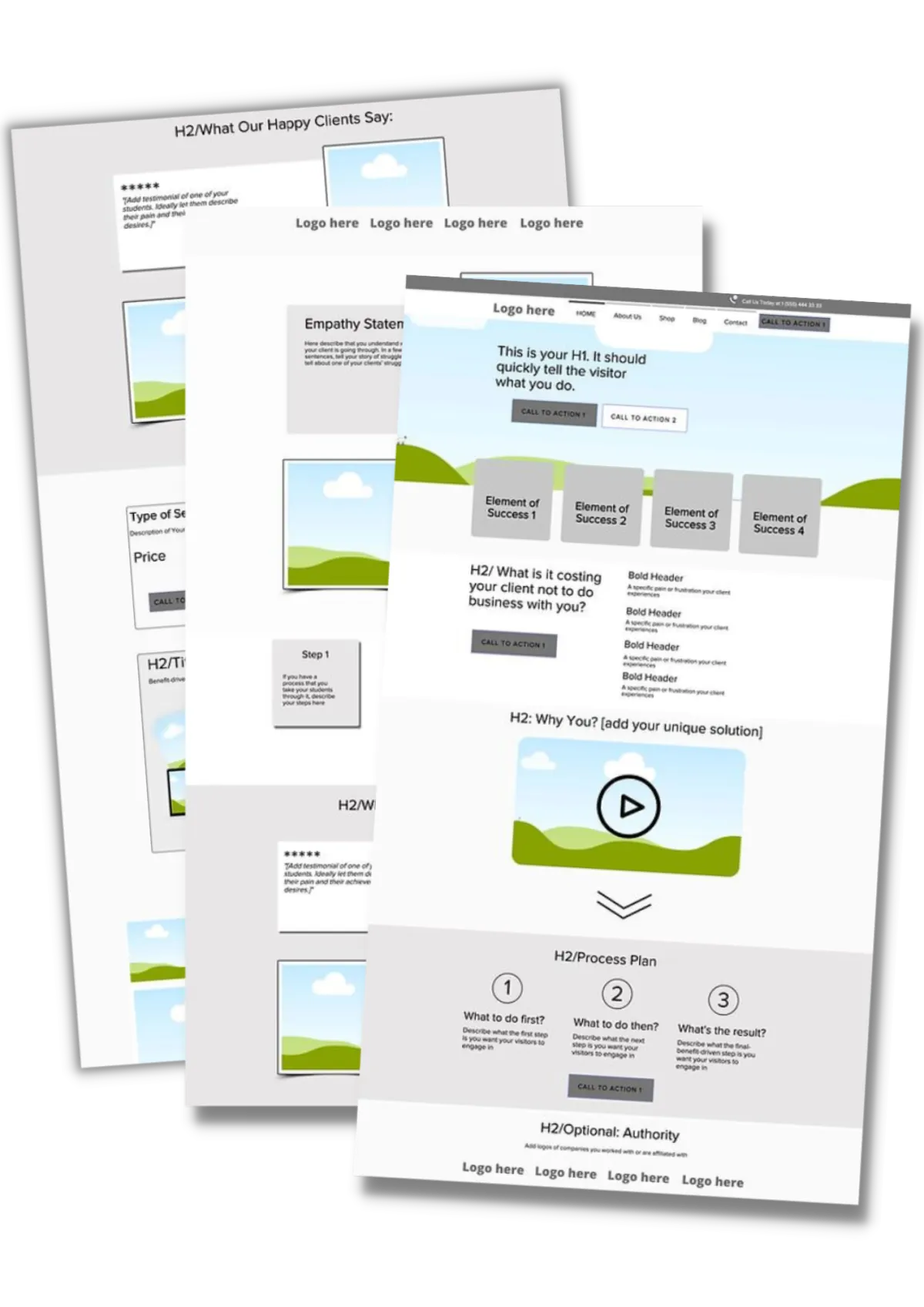
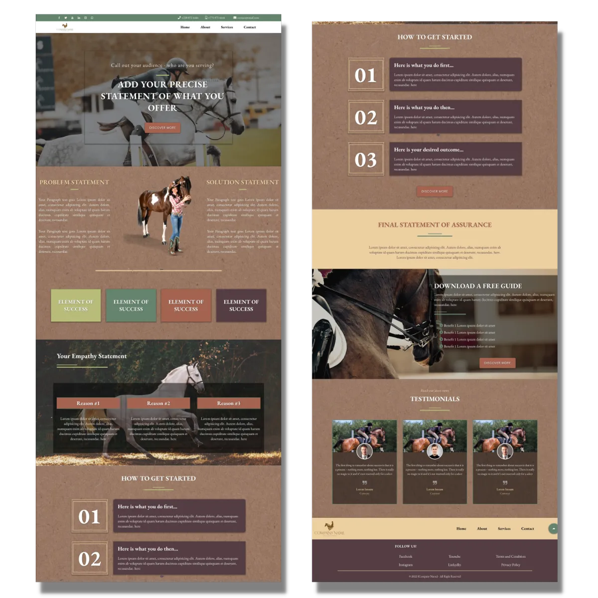
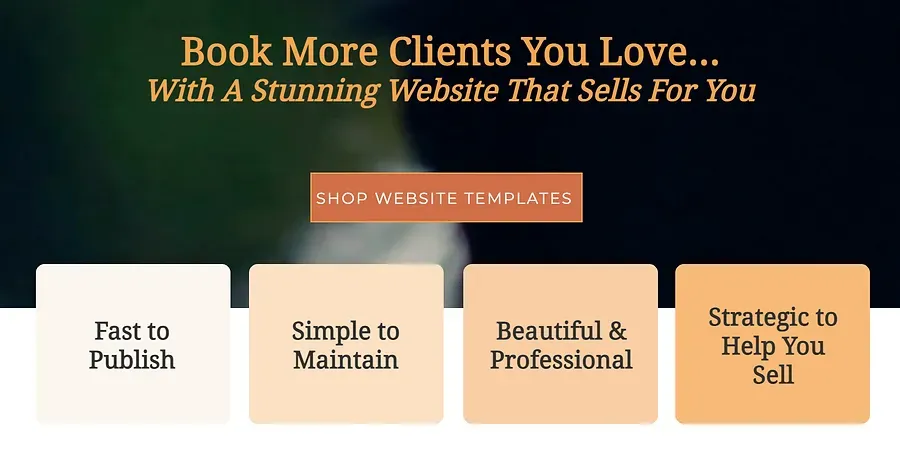
A home page should include 9 or best 10 elements!
1. The Headliner (in the Hero section)
What problem do you solve for who with what?
2. The Success Outcomes
What are the 3-4 outcomes of a successful partnership with you?
Here is how I've solved this for my HorseBizSuccess Homepage:
3. The Frustrations
What are your clients' most common problems, frustrations, worries, fears? State them clearly, and the right visitor will self-identify.
4. The Solution
What are you offering as a solution to their problem? And how will you solve it?
Remember that your reader is first only interested in what problem you solve. Then, how you solve it.
It’s important to give a short overview of the how and then add a more detailed description on the About Us page.
In addition, if you have a bite-size ‘taster’ of your solution, could you create a pdf or a short video that someone can access when they leave their email?
That serves to build your email list AND allows them to experience what you do. (This is what you get to do with this guide.)
That is where the 'Transactional Call To Action' I talked about above would send the reader to. Click here to get 24 freebie ideas!
5. The ‘Herd’ Leader
You want to appear as the wise guide who guides horse and rider to ‘victory’. Who are you that you can be trusted? What experiences have you gone through that make you trustworthy?
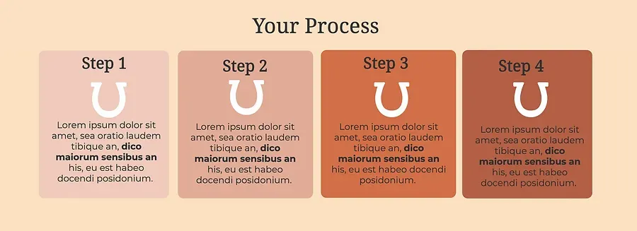
6. The Process
Readers (like horses) don’t like surprises. Give them a step-by-step process on how you can work together.
Here is how I've added the process part to my 'Holliston Barn' template:
7. The Story (optional)
If you or your clients have a common background story that leads you to develop your program (treatment etc.), then tell it here in one paragraph. If many of your readers share the same story, you can quickly create a deep bond.
8. The Trail
While there is more space for explaining your unique framework, list it on your homepage. What are the steps you usually guide someone (or a horse) through when they sign up with you? Tell them.
9. The Testimonials
Most people have a separate testimonial page. That is a waste. Instead, either add a testimonial section with multiple testimonials to your homepage, or spread them out across your page. Create a color section and add a small image and a couple sentences.
Keep it short and succinct. What was their pain before and how do they feel after?
If you’ve been published in a magazine or a well-known person talked about you, add that too.
10. The Call-To-Action
Those are buttons that call someone to do something.Add them to the right side of header, and most sections of your website.
Most of them should be direct call to actions like:
‘Book now
’'Let's chat' (my favorite)
‘'Call now’
‘'Schedule a visit’ etc...
''Join Free Now'
''Watch It Now'
''Find Answers & Tips On Our Blog'
...but some can be referring to your ‘taster’ freebie by creating an anchor that sends the reader directly to it.
Below is a great example how INTUIT Mint has designed their header:
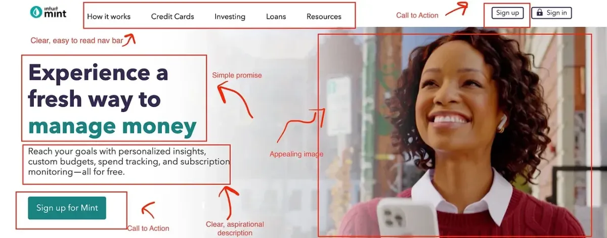
I hope you can see how vital your homepage really is. If you'd prefer to pick one of our pre-designed templates, you can click below to pick the one that speaks to you.
Chapter 5
How To Create An 'About Us' Page
The main purpose of an 'About Us' page is not to talk about YOU but how you can help the potential client solve a problem and help them to a solution that ultimately allows them to do what they dream of.
It should include the following:
1 - Your mission
What problem do you solve for who and, most importantly HOW and if possible WHY.
2 - A photo about you...
...and if you have a team, add the team members.
3 - A personal story
This is the place to tell a bit more about you, never forgetting that whatever you share should refer back to the problem, the solution and the reward.
It's powerful to write a personal story on how to you too had this problem, couldn't find a solution and then, by trial and error found a solution.
(Dang, I always type 'trail' instead of 'trial'...Freudian slip...unfulfilled desire??? ;-))
4 - Testimonials, rewards, certifications (if relevant to your current ideal audience), endorsements, publications, possibly statistics (this many people and/or horses helped).
5 - Duplicate of your freebie and or a different signup form.
Common mistakes:
● Making the page too much about you
● Focusing too much on your love for horses and your education
● Providing irrelevant information, as it pertains to the problem your visitors have
● No linking to your service page
● No call to actionNot being clear about what you want visitors to do after they’ve read over your page
Chapter 6
How To Create A Service Page
The main purpose of your Service page is to demonstrate that you have the right solutions for the stated problems. That YOU are the one to help them solve it.
Keep the wording casual and personal. Make the visitor feel comfortable, so that they already feel as if they've talked to you in person. That takes away the barrier to calling you.
Let's see what this would look like...
1 - Create a section for each of your services
● Create an outcome-driven title and subtitle.
● Add a short description.
● Link to a more detailed description page or to a checkout.
2 - Add case studies under each section, before-and-after pictures, proof of the value of your services.
Show them that you’re the right person for the job.
3 - You can add a Q&A section here as well. What questions do people usually come to you with? Answer them here, and you’ll save hours of repeating yourself.
4 - Don’t forget your call to action.
It can link to:
● Your contact page.
● Directly to an email or phone number.
● A pop up that offers them various ways to get in touch with you.
Chapter 7
How To Create A Contact Page
I think by now you've realized that your Contact page isn't THE place where you hope everybody goes to.
By now you've designed a site that left 'Hope Marketing' in the dust. Still, the Contact page is a convention and therefore should be optimized.
See what you should add to it below...
1 - IMPORTANT: Add a conversational paragraph about how long it takes you to get back to your visitor.
In a FB survey, I asked horse owners what their greatest frustrations were with horse professionals and most mentioned that it was hard to reach them and that it took several tries until they returned their inquiries. Don’t be one of those!
2 - Add your professional email address in addition to a contact form.
3 - Add a prominent phone number and make it clickable, adding a clickable phone number to make it easy for site visitors to call you or your business quickly and directly when they are visiting your site from their phone.
4 - Add a contact form. They have an advantage that you can track who contacts you, you can send them to a Thank You page, it reduces spam and you can guide someone as to what information you’d like them to share.
5 - Add an image of you to the left of your phone number or email. Studies have shown that this increases the likelihood of someone contacting you!
The biggest goal with your contact page is to be personable, informal, and develop trust that you WILL get back to them within a certain time frame.
Then give them as many preferred choices to get in touch with you, reducing the chances that they will keep shopping for another service provider.
Chapter 8
24 Equine Freebie Ideas
What's a freebie?
It's a taster of what you offer. It can take many forms, like a short video, a case study, a '5-Step To' article, a checklist or a guide (like this one).
It's worth spending some time thinking about a bite-size solution your visitors would find valuable enough to give you their email.
A freebie should be helpful to someone whether they ever become a client or not. Just reflect back over this guide...
BUT it should also serve as an educational sales tool. In that way, your freebie should be created to lead the reader (viewer) closer to purchasing one of your services.
I stated right at the beginning that this guide can help you completely revamp your old site. On its own, without you ever working with me.
BUT...I also know that many of you want more help, now or in the future.
Many of you want to get their website-that-sells up in a few hours, want help finding the right words for your site, need help with the tech aspect of building a website etc.
And for that, I created a solution.
BUT that doesn't diminish the power of this free guide. It educates, helps and guides (I hope).
As should your own freebie.
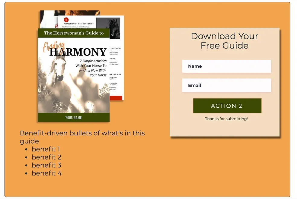
Below I've created a list of 24 title ideas for freebies you could create or modify to fit your expertise.
I've researched popular horse magazine for article titles to come up with those. You can do the same.
Magazines have to sell.
Magazines have a testing team.
Magazines have professional copywriters.
Magazines have years and years of stats about what topics are most popular.
Don't reinvent the wheel.
Do what they do!
Here is a list. And below that list, is a sample signup box design, with a full page invitation that you can copy (or buy the template ;-)).
The List:
* 6 Tips For First Time Riders
* 3 Tools To Become a Bolder Rider
* 17 Simple Fitness Changes That Improve Your Riding
* 4 Reasons Your Horse Is Too Hot To Handle...And The 1 Exercise To Calm Him Down
* 3 Things To Know: Runaway Horses
* 4 Things To Check To Evaluate Your Shoer’s Expertise
The How-To:
* How To Teach Your Horse A ‘Whoa’ You Can Trust
* How To Smile Your Way To A Confident Rider
* How To Overcome A Setback On Horseback
* How To Trim Your Horse's Feet Back To Soundness
* How To Know For Sure That Your Saddle Doesn’t Hurt Your Horse
The Tools:
* The #1 Secret To Teaching Your Horse 20 Voice Cues
* The Horse Whisperer's Secret To Making Your Cues Invisible
* For Confidence, Do This Before You Buy That Horse
* The 5-Step ‘Stop & Drop’ Exercise For Safer Rides
* The 6 Stages Of Suppleness...Most Riders Get 3 Stages Wrong
The Question:
* Balance In The Saddle - Do You Have It?
And 3 Ways To Perfect
* It Stressed When Riding Out Alone?
The 1 Mental Exercise For A Calm Mind
* Do you Know How To Beat Your Riding Fear?
Learn With This 5-Minute Video
* Do You Know How To Tame Your Show Jitters?
Learn The 5-Breath Method
* Are You A Confidence Maker Or Breaker?
Discover How To Sooth Your Horse
The Guide:
* The Ultimate Guide To Smart Trail Ride Prep
* The Guide To A Horse That Stands Still...No Matter Where
* The Final Workbook For Winning Your 1st Working Equitation Show
Below is how I designed one for the STRIDE template. Of course, you can can deliver your freebie in all kind of formats!
Bonus
Live Templates Walkthrough
I hope that this guide has helped you unhobble from website-creation overwhelm and moved you to action.
Yes, it is possible to build a website that helps you book more clients, whether that is for your 1:1 services, clinics or even virtual events, for better income and less frustration working with the wrong clients.
A website-that-works saves you time having to sell your services , allows you more time for your own horses and truly works for you 24 hours a day.
BUT...if this comprehensive guide is still not enough, you know by now that I have created entire template packages that include all the trainings and instructional videos you need to get this kind of a website up.
So, to finish up together, why don't I give you a quick walk through of the templates and show you how easy it is to change fonts, images and color themes to make it completely your own with a few clicks.
I've researched long and hard to find a website platform that supports what you, the equine professional, needs most:
● Growing emailing your list
● Saving time with automated clinic management
● Automating bookings
● Selling right over the web
Come follow me and let's see together how to tame your website design overwhelm!
Whatever action you take from here out, please know that you DO make the world a better place for horses, for humans and ultimately for the planet.
And I thank you from the bottom of my heart for your devotion to the magnificent animals we love so much!

- Christiane
DISCLAIMER: The sales figures stated above are not typical. The average person who buys any “how to” information gets little to no results. We use these references for example purposes only. Your results will vary and depend on many factors …including but not limited to your background, experience, and work ethic. All business entails risk as well as massive and consistent effort and action. If you're not willing to accept that, please DO NOT GET OUR INFORMATION.
This site or product is not part of or endorsed by Facebook, Google, or any social media platform in any way.
FACEBOOK is a trademark of META PLATFORMS, Inc. YOUTUBE and GOOGLE are trademarks of ALPHABET, Inc.
Absolutely nothing on this web page should be considered as any type of earnings claim for what you will earn simply by using our trainings or systems.
This is an ONLINE TRAINING RESOURCE intended to help BUSINESS OWNERS and ADVERTISERS learn how to get more customers for their products and/or systematize their business. It is NOT a “business opportunity” or “get rich quick” opportunity.
The testimonials, figures, and screenshots on this page are real but they are displaying exceptional results from our best customers. These results are not typical. They are not intended to guarantee, promise or represent that you will get the same result just by signing up.
This will require work and you will be the ultimate person responsible for taking action and making sure you get the results that you want.
Copyright 2023© HorseBizSuccess, INC., All Rights Reserved | 570 Collinsville Road; Columbus, NC 282722